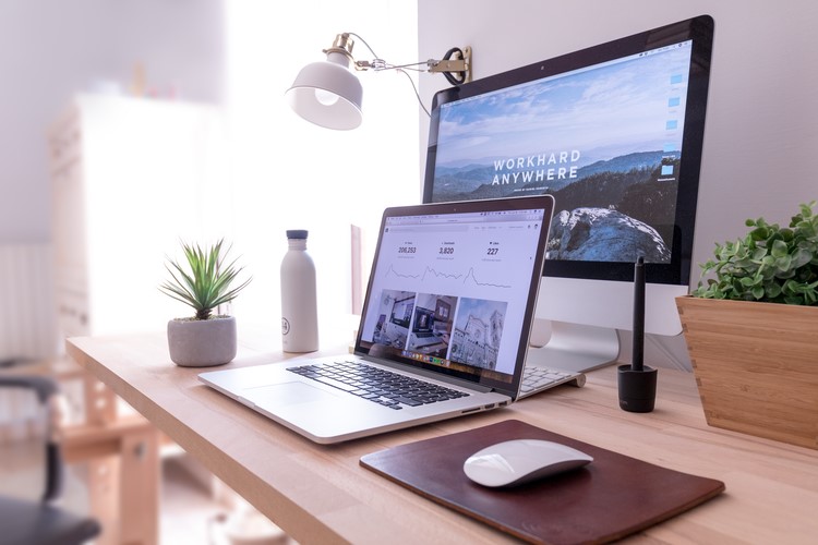
When individuals observe balance and harmony, they feel happy. The sense of ease and happiness against repulsion and displeasure distinguishes aesthetic from visual imbalance. Everything immediately stands to reason with a pleasing visual balance, particularly in portfolio websites.
A high quality of aesthetics and visual display conveys to many potential clients and associates that you have a strong work portfolio and work ethic.
We developed this guide to all you need to know about balancing text- and image-based content formats.
In Search of the “Ratio” in Portfolio Website
You’ve arrived at the wrong destination if you’re seeking a “magic ratio” to define how much room to provide to text or visual components. Only plan, procedure, and conceptual design are present.
However, the following recommendations can be useful to you.
- We are in a very visual era right now. Make a great visual impact to draw viewers in. The majority of projects will have more visual information than written content
- Aim for a graphic to be included in between 60% and 80% of the design for the initial appearance
- Visual effects and text should seem roughly equivalent in visual weight across most projects. Ensure the text and the images are cohesive
Guidelines for Finding Balance in Portfolio Website
Here are some ideas to consider when trying to achieve balance.
- Don’t even use words until you have to
- Communicate information. Don’t explain something you can demonstrate. Avoid using extraneous phrases or imagery that are repeated
- If the style feels off-balance, make the text visual or convert pictures into text
- Strive for equivalent surface space for images and text to achieve an “apparent balance” if you are unsure how much text is necessary
How Can Text and Images Be Balanced in a Portfolio Website?
Any website can balance text and graphics in a variety of ways, such as:
- A split screen layout can give both parts equal room by placing the picture material on one half of the monitor and the text-based information on the other. Site balance is achieved even if the text content is smaller than the image because it will maintain the same visual weight
- Rotating text and picture in square designs: If your website is created using panels, you can achieve balance by rotating the text and image content in each panel
What Are the Advantages of Text and Image Balance in a Portfolio Website?
Successful text and image fusion can have a range of advantages and benefits. These consist of:
- Optical symmetry: Because text and images are two separate sorts of material, it doesn’t imply you can’t balance them against each other to produce them. For instance, equivalent images and text on either side of the display can strike the ideal balance while making your website appear symmetrical and well-aligned
- Both attractive and educational: By skillfully blending your text and pictures, you may build a website that is both visually appealing and educational, using technology for learning
- Enhancing customer experience: By balancing text with pictures, you may make your site extra user-friendly by sparing visitors from having to read a lot of content. This successful content will be broken into subtopics, graphic imagery, and photos to make the website more user-friendly and straightforward to read
Listen to Your Viewers’ Expectations
It’s critical to consider the audience’s expectations when combining text and images. For instance, a consumer might be disappointed to see a major update with little text because they would not anticipate a graphic novel from an author.
When considering people’s expectations, a range of demographic variables are considered, but odds are you already understand what is effective and what isn’t from the approach to designing experiences. Expand on the results.
Pay Attention to the Method of Delivery
The delivery technique is another element in balancing text and images. Projects that are displayed on screens have more visual elements. As you enter the portfolio, the balance favors more text.
Both large and small businesses depend on text or images. Legibility is a major consideration. When discussing anything significant, an image or a term will probably be employed. Numerous phone apps employ a picture or a text block from display to display due to their small sizes, allowing users to concentrate on one piece at a time before going to the next.
Conclusion
Although the brain processes images more quickly, words can help us grasp things better. Optimizing your portfolio website and establishing a balance between text and visual material go hand in hand.
Consider balance throughout the entire website for a stunning appealing portfolio website.
